
Polemika
branding
packaging
art direction
research
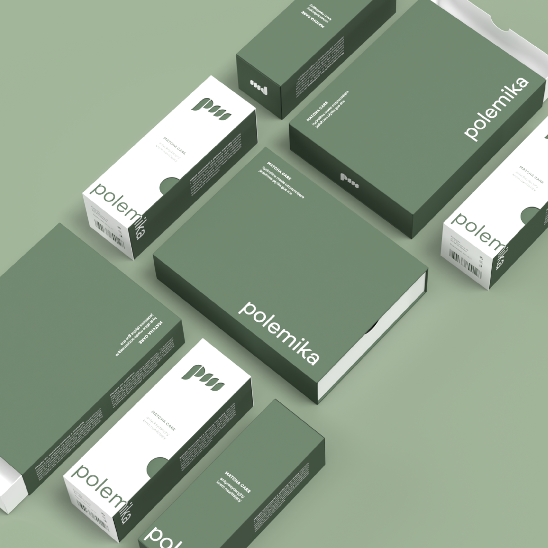
Polemika is a Polish natural skincare brand focused on simple ingredients and respect for the environment. The name comes from the combination of the founder’s daughters’ names — Pola and Mika.
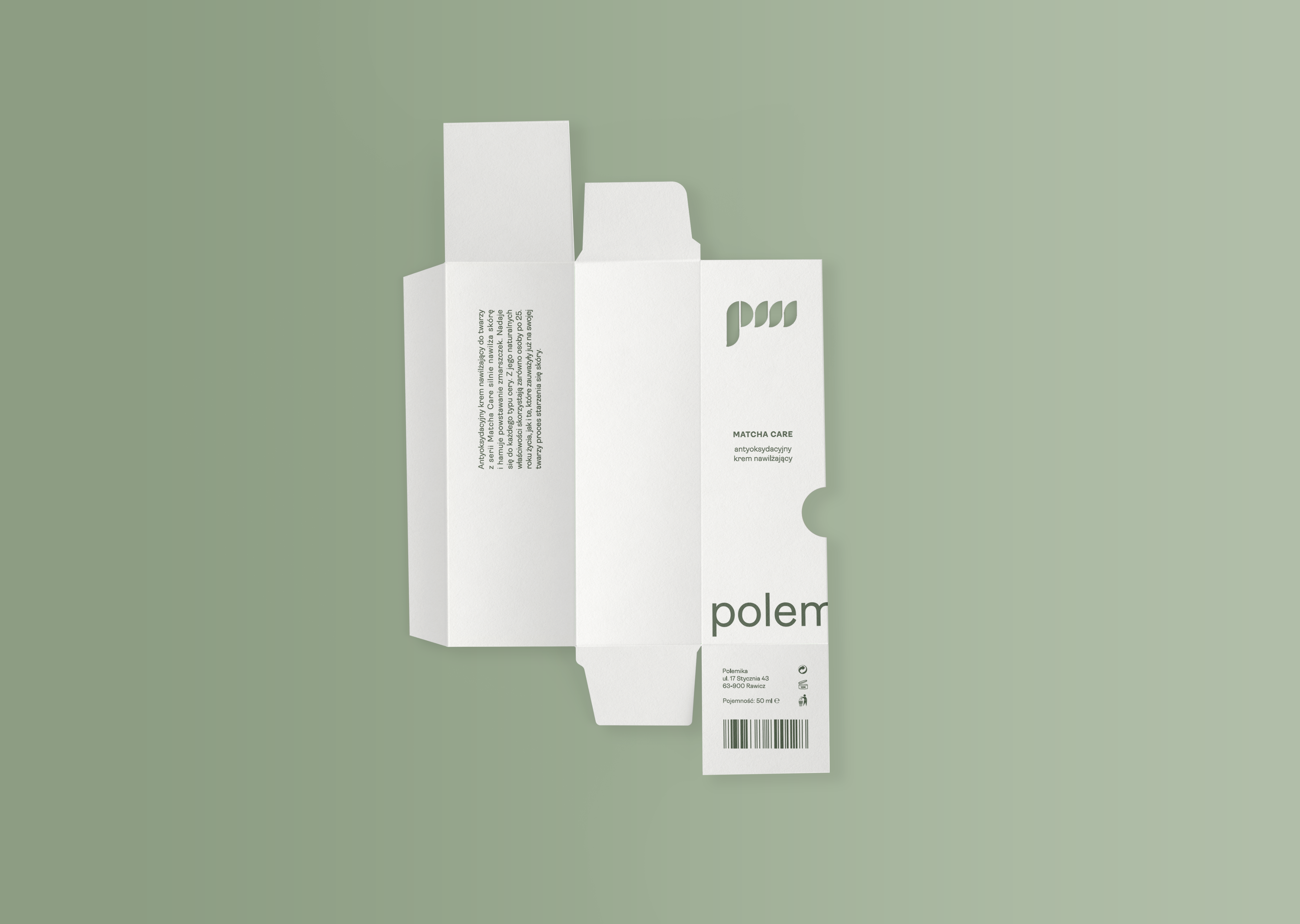
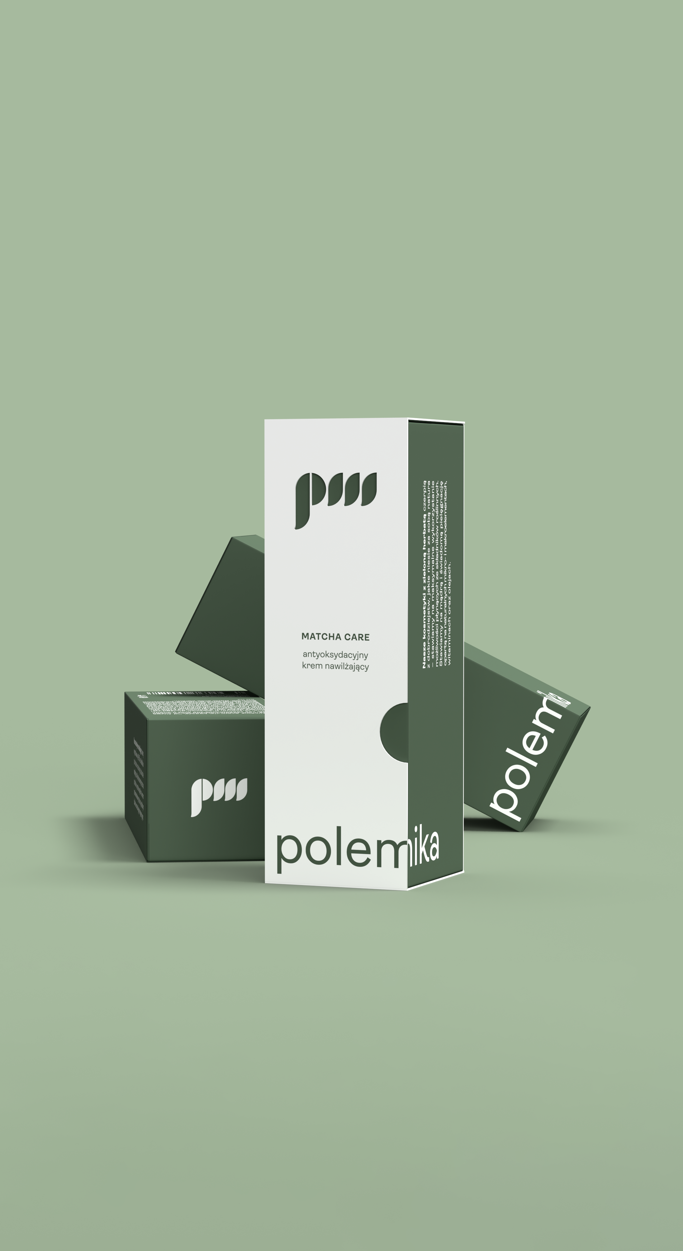
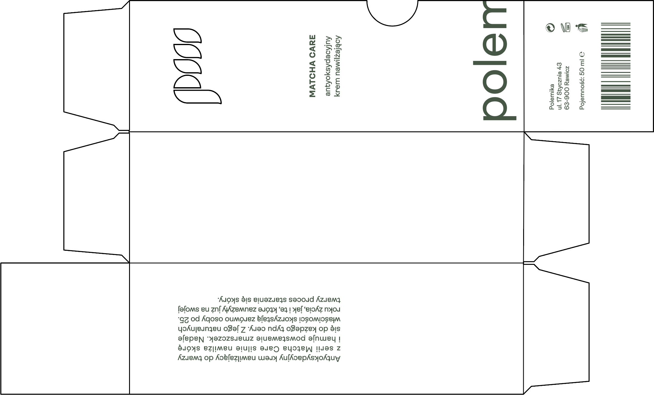
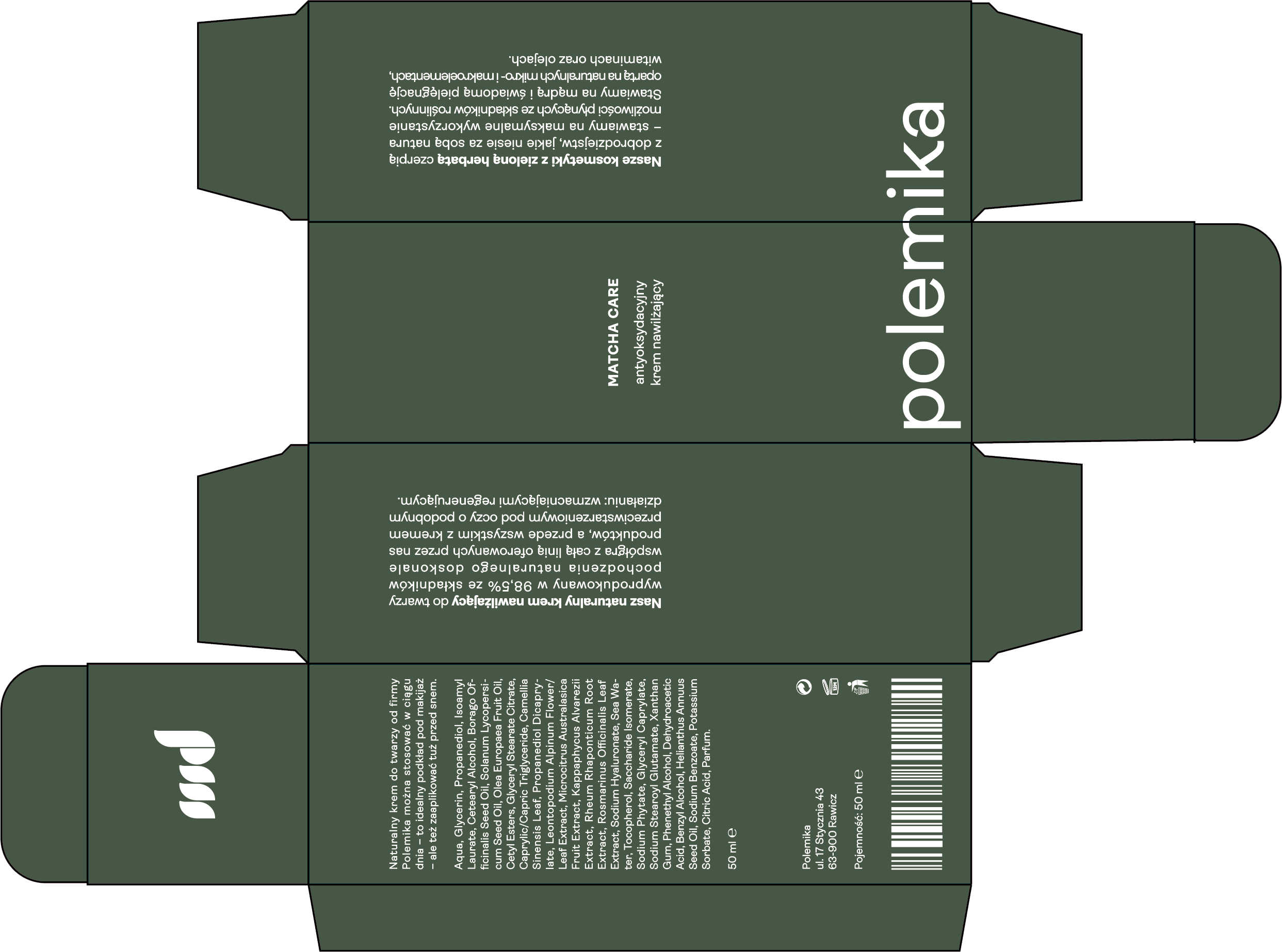
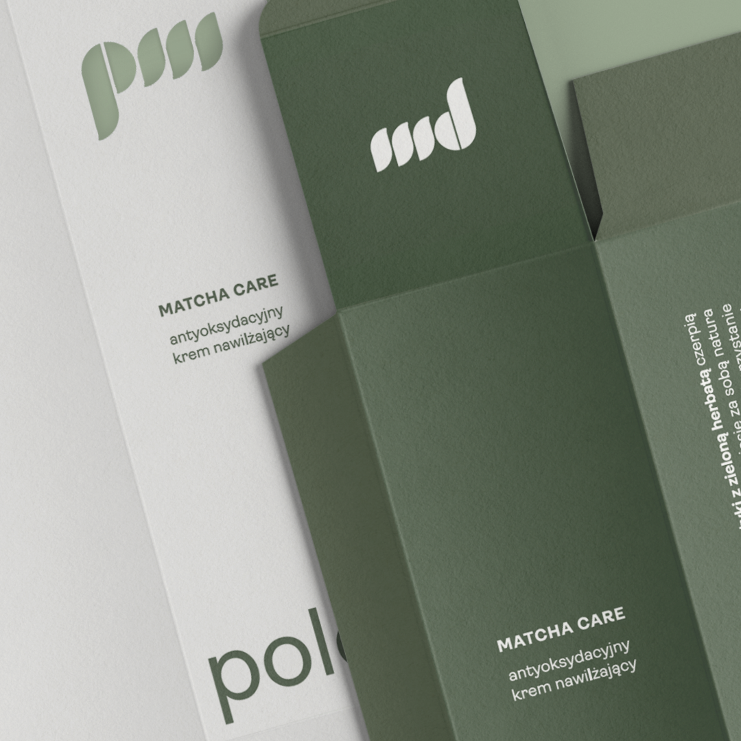
The packaging and symbol design were created to highlight the plant-based nature of the products. The visual concept was inspired by green tea leaves — the brand’s key ingredient.
The packaging design is based on minimalism and clarity, reflecting the clean formulas, high quality, and the brand’s transparent approach to communication.


Polemika
branding
packaging
art direction
research
Polemika is a Polish natural skincare brand focused on simple ingredients and respect for the environment. The name comesfrom the combination of the founder’s daughters’ names —Pola and Mika.
The packaging and symbol design were created to highlightthe plant-based nature of the products. The visual conceptwas inspired by green tea leaves — the brand’s key ingredient.
The packaging design is based on minimalism and clarity,reflecting the clean formulas, high quality, and the brand’stransparent approach to communication.

Polemika
Polemika is a Polish natural skincare brand focused on simple ingredients and respect for the environment. The name comesfrom the combination of the founder’s daughters’ names —Pola and Mika.
The packaging and symbol design were created to highlightthe plant-based nature of the products. The visual conceptwas inspired by green tea leaves — the brand’s key ingredient.
The packaging design is based on minimalism and clarity,reflecting the clean formulas, high quality, and the brand’stransparent approach to communication.
branding
packaging
art direction
research
